.
.
.

This is the second installment in my review of OC’s Covid-19 curves — the first one was here — and includes discussion of concepts like what we mean by “flattening the curve” and what the curve even is. (It’s a normal distribution — and if that doesn’t make sense to you, click that link soon!) The underlying data can be found here.
This is probably the last one (at least for a while) in this much detail. I’m trying to do these by hand-made creation of the graphs — a process complicated by the Health Department keeps refining and revising its previous reports, which is wholly appropriate … but imposes burdens on those who would create graphs.
(I’m hoping I can hand this to someone who has graph-producing statistical software. My last such program, when I was still doing data analysis as part of my living, came on 3.5 floppy disks.) Let me know if there are any takers!)
Anyway, below is the new version of the graph. As before, the light gray circles are each day’s reports. The dark graph bars are the rolling 5-day averages, meaning that the score for each day is averaged with the two days before and after it. The pink line, new this time, is a curve made up of 7-day averages — in other words, the averages for a week centered on each day. That’s as much smoothing as I think I can justify — and, as you’ll see, even that isn’t enough!
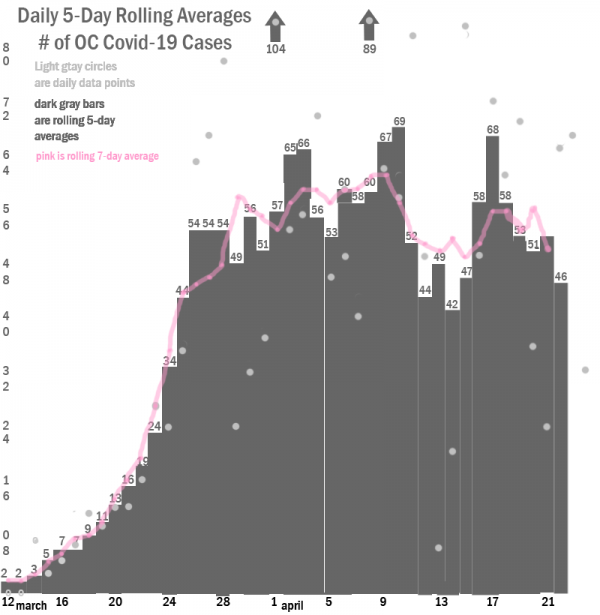
This is a lot better than the spray of light graph dots you see for different days. And for the first couple weeks, it has some coherence. But after that, the data becomes extremely noisy. One day records only 7 cases, coming not far between two other days in the 80s. There are possible explanations for this — my sense is that most cases come out on Mondays and Wednesdays — and I should note right there that each day is actually reporting the total for the previous day — but without more understanding of what OC Public Health is doing I don’t want to make assumptions that could guide even more aggressive, theory-driven, curve smoothing. It seems vary likely, though, that some sources of the data are not reporting daily, but bundling a few or several days into one report. Smoothing can help solve that problem, but in this case it’s not doing is so well.
All that said, we can take some lessons from these curves — and to the extent that the data is trustworthy it should give us some community pride. We’ve not only flattened the curve, but in a phrase I just started hearing within the past week or so, we have partially crushed the curve!
If you had shown me just the first two weeks of this curve, I would have bet that it would go about 1.5 times as high, before coming down in a stretched-out mirror image to the right. In the last week of March, it’s like someone hit that grown curve in the head with a board.
Starting after those three 54 data points in a row, what looked like a normal curve becomes almost random. The average of the rest of the scores is 55.1. Nor is there a clear trend (except for increasing noisiness: The first two weeks after those 54 triplets has an average score of 55.8; the next two weeks has an average of 54.0. So we can’t say with any confidence that it’s even going down.
But there is a word for that sort of distribution, and it’s one we would like to see. It’s “flat” — as in “flattening the curve.” It’s sudden and profound, compared to where the curve looked like it was going — which is why is also looks a but like “crushing.” I think that the most reasonable way to read it is that we adopted pretty strong social distancing — and it’s doing exactly what it’s supposed to do: pushing cases into a fatter, longer-lasting, non-resource depleting right tail. (Unless the slide in the last six days holds up over time, we can’t even yet see that right tail in this graph.)
Of course, I’m overlooking one important thing in interpreting this graph: testing. We’re still not doing enough testing, which would allow us to estimate cases that didn’t show symptoms — or at least not enough of them to send someone to the hospital — but that still would have likely been contagious.
Once we start with broader testing, we’ll show a bulge on the right side of the chart that will be an artifact of the fact that we haven’t been testing nearly enough during the first month and a half. That will panic us, but it probably shouldn’t. It just means that we’re getting a better look at the truth.
Sadly, the prospect of OC being seen as a viral hotbed may be worrisome enough that our especially powerful powers that be will discourage testing even when tests become available. That, in my opinion, would be criminal. Pervasive testing and contact tracing are two of the things we need both to flatten the curve and to allow us to reopen safely — and we’d best get on our way to that.
Two other concerns complicate a graph like this. The first is people coming into the county from outside, like those delightful crackpots sharing droplets last week in Huntington Beach. The second — even more ominous — is that the WHO is now casting doubt on the idea that getting Covid-19 necessarily (or usually, etc.) confers immunity. So much for “immunity passports” and the notion that the young and healthy are safe.
The good news is that greater experience with Covid-19 means that we are developing better “best practices” for treatment, so that the likelihood of dying from the disease may decline even prior to a successful vaccine. (The recognition that “proning” — sleeping on one’s stomach, instead of “supine” on one’s back — seems to help people survive is one such exciting development; the notion of checking oneself with an oximeter to see whether lung function has been compromised even in the absence of symptoms is another.) So staying healthy longer may mean surviving better if and when you do succumb.
You can find more good information from the State Department of Public Health, here. and here.
This is your Weekend Open Thread. Talk about that, or anything else you’d like, within reasonable bounds of rationality. And also do not, no matter what you hear, snort powdered bleach. (It doesn’t actually contain chlorine, but it’s nothing that you should want in your lungs.)
From Ricardo, it’s pretty good:
Vic makes sense – loudly.
Hey Anaheim!
You know how, in the PR or “turd polishing” industry, they say, “The bigger it is, the worse it smells, and the more polishing it’s gonna need.” Well, that IS what they say, believe me. And this March 26 “emergency” $6.5 million giveaway to resort-advertising “Visit Anaheim” is requiring a RECORD amount of polishing. In fact it seems like a BIG chunk of that $6.5 million is being spent on a campaign to convince you and me that the $6.5 million is being well-spent!
Check out this video, but don’t just comment here, go to the original video and check out all the creepy worshipful zombie-like comments from the “Anaheim First” crowd. Don’t let those be the only comments either!
https://www.facebook.com/watch/?v=1135616243457322
Vern, it’s not “Anaheim First.” It’s ANAHEI’M FIRST.” Don’t you find that telling?
And speaking of what appears to be Pringle franchise opportunity, Jennifer Fitzgerald and other like-minded stooges started a group with the same name a couple years ago in Fullerton. I recall FFFF did a post on it, including mentioning the membership of Orange’s Jerbal Cunningham in the group.
Coincidence? I think not.
Thanks Greg. Its a tough job but somebody’s got to do it. Where is AI when it could do some of this modeling and projecting infections and deaths so we could avoid areas and get resources to other areas? Sorry, rhetorical question.
While the emphasis placed on the current preventative measures is working to help flatten that curve you show I think there is a different framework we need to look at in regards commerce in the time of Covid-19.
I rarely hear the criteria for reopening being that the employer is required to provide a safe and healthful workplace to their employees. That’s the law. You might have customers who wish to forego personal protection but employers do not have that option. I salute the forward thinking employers installing protective shielding, mask and sanitizer protocols. With the limited testing we have available we won’t be able to know how effective any measure will be but the law tends to look at the overall effort of the employer to comply.
Protective equipment and protocols need to be developed for every job now. We know a pandemic can happen and likely will again. Now is the time to develop solutions.
Thanks — but as I discovered prior to creating these charts, because no one was doing it, no one *has* to do it. But someone *needed* to, so….. A good portion of or writing here — probably higher for Vern than for me — fits the description of something that needed to be published but otherwise wouldn’t be.
(Of course, we publish some crap too, just to keep the machinery working.)